Your Cart is Empty
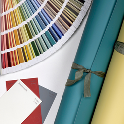
Amplify Your Design with Bold Color
Think red walls are outdated? Not with a few twists on the shade.
As the cold, cloudy days of winter come to an end, we look ahead to warmer months that bring with them a welcome dash of colour! Bright, bold hues give us an energy boost – like a B12 shot of colour!
One of the trending colors for this spring is Fandango (C2-527). This energizing soft, orangey-red is connected to the Root Chakra and infused with positive, motivating energy (which we all could use right now)! It’s lively enough to revitalize us into mindful motion but also remains solid and grounding. Since all C2 Paint colors are full-spectrum, they each have an inherently harmonizing nature.

Fandango, inspired by the lively Spanish dance, is a modern colour that leans toward Vermillion, bordering between orange, coral and intense salmon pink. So, for those of us who squirm away from the classic reds, you can now take this opportunity to fire things up in a contemporary way.
“Be brave, emboldened, imaginative, and look at the possibilities with a newly framed perspective for your colour direction; adding a colour like Fandango will really lift your spirits and expand your colour confidence.”
This nuanced shade is incredibly versatile, from the classic red, white and blue combinations to a modern take on traditional Asian-influenced inspirations.

Adding a high gloss finish to walls and furniture instantly creates a feisty, creative look.
For those dipping their toe into the world of colour with trepidation, try Fandango or other bold colors in smaller measures like behind an open bookcase.

Designer Tip: If you're adding color to a bookcase, keep a mindful eye to colour with the books and objects you stage with. Colour blocking with cyan and aqua and even a peachy pink looks incredible with orange or red; or go for high definition contrasts with all white, cream, and black. Ceramics with modern block prints and a few succulents or other greenery can complete the look.
Try an Orange or Red...
In the Office

It’s a great color for an office environment for those looking for stronger productivity and a sense of leadership.
As a Gallery Wall

Layering Fandango with colourful geometric shapes found in artwork, fabrics, wallpapers, or tiles evokes an embracing feeling.
On a Piece of Furniture

Make a statement by repurposing a furniture piece into something strikingly handsome and bold to create a centre of attention.
As a Tropical Escape
Layer in Fandango with other reds and saturated sandy neutrals, pinks, and corals, for a splash of brights that takes on a more tropical warmer palette.

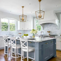
As a Twist on a Classic

In design, the eye always needs a place to "land" and rest, so pairing an energising orangy-red with a classic blues contributes greatly to the versatility of its use.
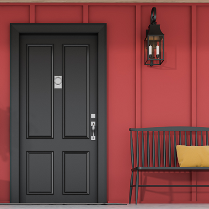
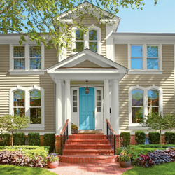
On the Front Door

Red is a dramatic front door colour that instantly says “welcome home!
What's your favorite bold color statement?
Also in Color Confidential


Recent Articles
- How Builders Using C2 Paint to Position Themselves as Industry Leaders
- These Paint Color Palettes Can Transform Your Smaller Bathroom into a Luxurious Respite
- 5 Ways to Harness the Power of Color in Your Interior and Exterior Paint Projects

- The Ten Commandments of Choosing Color
- Refresh Your Home This Spring: Top Painting Projects (Plus Recommended Products!)
- The Ultimate Guide to Choosing the Perfect Deck Stain for Your Home
- Painting Kitchen Cabinets: Your DIY Guide to a Perfect Finish
- Boosting Your Home's Value: 6 Home Improvement Projects for Maximum ROI
- Supercharge Your Aspirations by Choosing the Right Paint Color
- Why Do Painters Prefer C2 Paint Color Tools?